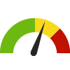
Indicator Gauge Icon Legend
Legend Colors
Red is bad, green is good, blue is not statistically different/neutral.
Compared to Distribution
 the value is in the best half of communities.
 the value is in the 2nd worst quarter of communities.
 the value is in the worst quarter of communities.
Compared to Target
 meets target;
  does not meet target.
Compared to a Single Value
 lower than the comparison value;
 higher than the comparison value;
 not statistically different from comparison value.
Trend

 non-significant change over time;
 significant change over time;
  no change over time.
Compared to Prior Value
 higher than the previous measurement period;
 lower than the previous measurement period;
 no statistically different change from previous measurement period.
 Significantly better than the overall value
 Significantly worse than the overall value
 No significant difference with the overall value
 No data on significance available
Age-Adjusted Death Rate
County: Morris
Measurement Period: 2019-2021
This indicator is archived and is no longer being updated. Click to learn more
This indicator shows the age-adjusted death rate per 100,000 population due to any cause.
Why is this important?
Age-adjusted mortality rates can provide a general sense of a community's health in comparison to other communities. The leading causes of death in the United States are heart disease, cancer, chronic lower respiratory disease, cerebrovascular disease (stroke), and unintentional injuries.
Clear this location
County: Morris
636.7
deaths/ 100,000 population
Source:
State of New Jersey Department of Health
Measurement period: 2019-2021
Maintained by: Conduent Healthy Communities Institute
Last update: November 2023
Measurement period: 2019-2021
Maintained by: Conduent Healthy Communities Institute
Last update: November 2023
Compared to

Technical note: Rates for previous years may not reflect the most recent population revisions made by the State of New Jersey Department of Health. Please consult the source for the most current rates.
Graph Selections
Significantly better than the overall value
Significantly worse than the overall value

deaths per 100,000 population
| County | Source | Measurement Period | Deaths per 100,000 population | |
|---|---|---|---|---|
There are 5 County values. The lowest value is 636.7, and the highest value is 791.2.
Half of the values are between 636.7 and 756.2.
The middle (median) value is 756.2.
Data Source
- State of New Jersey Department of Health
Maintained By: Conduent Healthy Communities Institute (Methodology)
Filed under: Health / Mortality Data, Health Outcomes